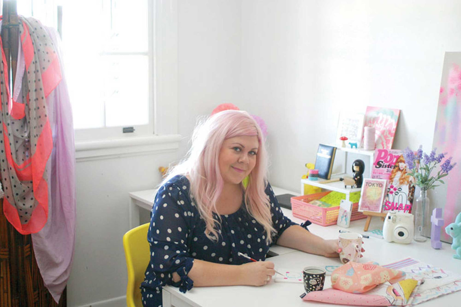
Tiffany Atkin launched her first solo show in February 2015 dedicated to Japanese pop culture. She’s a Brisbane based illustrator and designer with over 10 years in the art and design industries.
We are delighted to feature her delicate and playful style in our latest range of Notelys.
How did you get started as an illustrator?
I’ve always made art, but the turning point was probably when I was working full time as a graphic designer for a magazine and began dabbling in illustration after being inspired by illustrators like Kat Macleod, Bei Badgirl and Rik Lee. I’d go home from my full-time day job and illustrate all night. Then I was lucky enough to have a few opportunities to have work featured by the magazine I worked for (thanks to the editor who was very encouraging and supportive). That then lead to other opportunities and it really just took off from there.
What do you love about it?
Being able to express a feeling or a thought as tangible imagery. It’s like therapy really! I also get a kick out of seeing my work in other people’s homes – I love when people send me happy snaps of my illustrations on their wall!
In your years as a creative, has there been a turning point or catalyst for changing your path?
I think over time I have been spending less time doing more traditional design work for fun and have focused more on painting. Hopefully I can keep doing this for a long time. I like the idea of seeing a progression of personal style over a lifetime.
Tell us about how your work has evolved or changed over the past few years…
There have been a few changes in my day-to-day life in the last few years that I think have had an effect on my work. The main change was moving to the Sunshine Coast – I think being more exposed to the natural environment has crept more into my work as a result. Also having a young family has made me try to be more focused with what I’m doing with my time in the studio.

What kinds of illustration projects do you usually take on?
In the early days I took on anything and everything and needless to say they are not all featured in my portfolio! The ‘bread and butter’ work is not to be sneezed at though, it builds confidence and is good practice, but I must admit it’s nice to be able to be a little more selective with projects these days. I love working with other creative brands, which is where my illustration often crosses over with my graphic design practice. I’d say my favourite projects to work on at the moment would be album cover art (when I’m not making images I’m making music, so I do have a little soft spot for the industry).
What are your favourite tools of the trade?
Macbook pro, Wacom tablet, paint/ink/bushes, Pantone mug and Lady Grey tea!
Tell us about your workspace…
I’d love to say it’s well-lit, organised and huge, but I admit it’s the opposite of all of those things – it’s a bit of a fairy-lit dungeon cave but it’s a nice little space and despite shelves upon shelves of art supplies I do mostly know where things are (organised chaos…)! I tend to change my ‘possy’ often, sometimes co-working, sometimes from my home studio, other times from a cafe or just my back patio!
What was the inspiration behind your Polar Wandering design for the Notely Artist’s Collection?
I wanted to create something whimsical and fun but still in line with the beautiful, natural, eco-message that Notely is all about. Plus I think that polar bears are pretty amazing animals!
Tell us about your creative process. Are you a digital or analogue kinda girl?
There is something very rewarding about committing pen/paint/ink to paper, though I do enjoy the endless undo that digital allows! Most of my work starts out as traditional hand-made textures and sketches, but the final piece usually ends up digital, it depends on the project and where/how it will be used.

If we peeked over your shoulder on an average day, what would we find you sketching in your Notely?
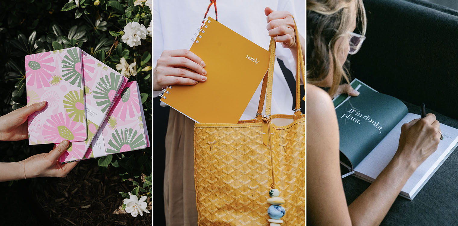
Hopefully nothing boring like the words broccoli, eggs, bread scrawled in biro…haha! Lately I’ve been practicing brush typography so you’d probably find a few messy inky letters and words… the occasional idea for a new textile design, and maybe a shopping list.

![Spearmint A6 Pocket Notebooks [BULK 8 PACK] - Notely Lined](http://notely.com.au/cdn/shop/products/spearmint-a6-pocket-notebooks-bulk-8-pack-notely-399099_1600x.jpg?v=1699275130)
